Up until today, this blog was running the default WordPress theme. Twenty Twenty-Five. It worked — the posts were readable, the layout was functional — but it looked like every other default WordPress site on the internet. Not exactly the first impression I wanted to make.
So I told Claude: “The design is terrible. Fix it.” And what followed was a surprisingly involved process of picking a theme, installing it, discovering things were broken, and fixing them one CSS tweak at a time.
The Before: Default WordPress
Here is what the blog looked like before any design changes:
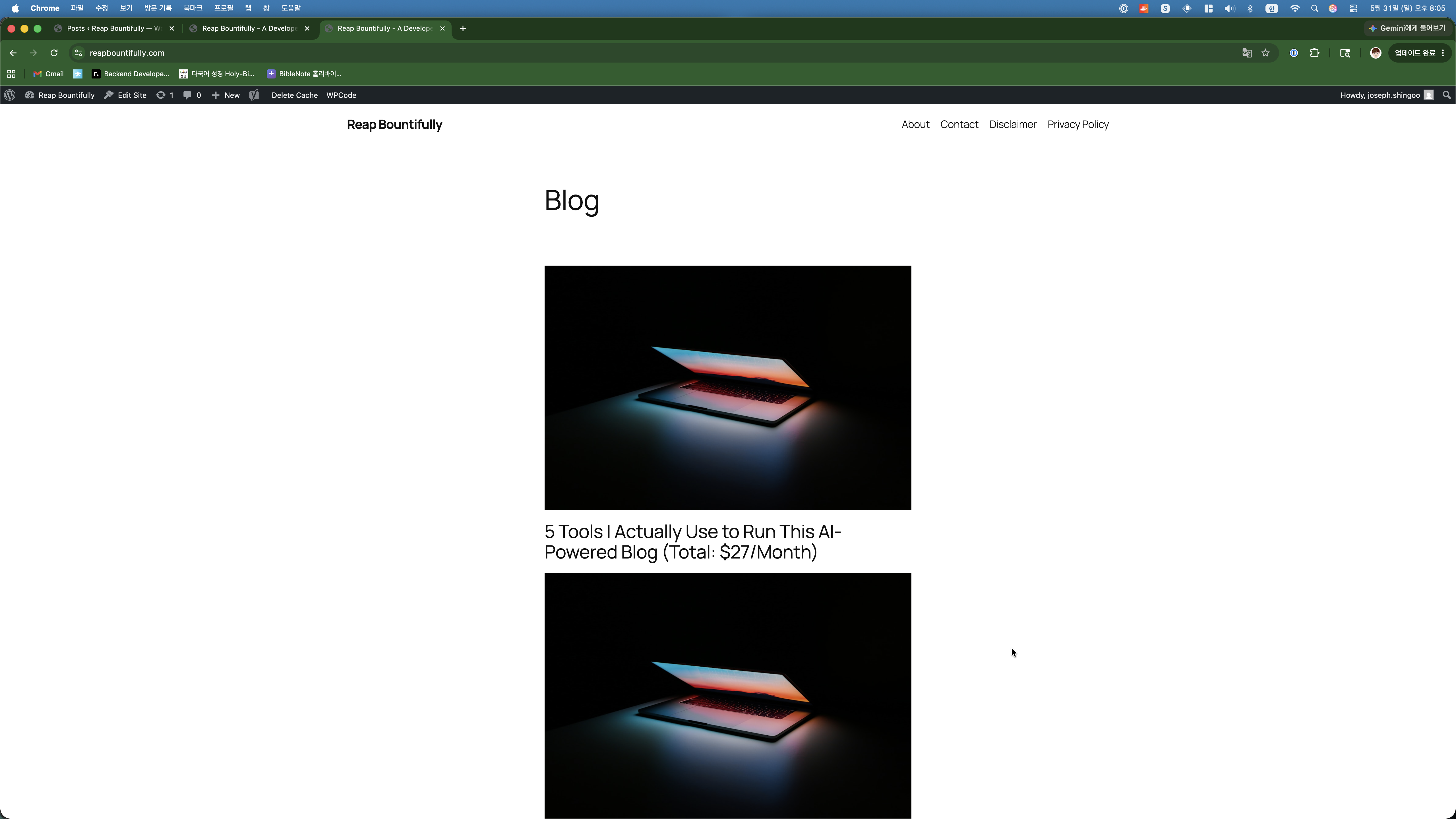
A single-column list of posts, stretching endlessly downward. No cards, no grid, no visual hierarchy. Every blog post showed its full content right on the homepage. You had to scroll through entire articles just to see what else was on the blog. It looked like a Word document, not a website.
Me: “Which theme should I use?”
Claude suggested three free themes popular with bloggers: Astra, GeneratePress, and flavor. It recommended Astra specifically because it is lightweight (fast loading = good SEO), highly customizable, and the most widely used WordPress theme in the world — which means good community support and frequent updates.
I said “go with Astra” and Claude installed and activated it via SSH. One command, done in seconds.
The Problem: No Post Titles
When I loaded the site after the theme change, something was immediately wrong. The blog posts showed up as cards in a grid layout, which looked much better — but the post titles were completely missing. Just images, dates, and excerpts. No titles anywhere.
I screenshotted it and sent it to Claude. What followed was about 20 minutes of debugging where Claude tried multiple approaches to fix it:
- Changed the Astra blog post structure settings — did not work
- Tried different structure values — did not work
- Added custom CSS to force-show titles — titles were not in the HTML at all
- Checked the actual HTML output — confirmed titles were not being rendered
- Finally figured out it needed to be set through the WordPress Customizer
This is a good example of vibe coding in practice. When things break, you do not always get it right on the first try. Claude tried five different approaches before finding one that worked. But the key difference from doing it myself: I did not have to understand any of the intermediate failures. I just kept sending screenshots and saying “still broken” until it was fixed.
Fixing the Layout
Once titles were showing, there were more issues. The “Read Post” link was floating in the middle of cards instead of sitting at the bottom. The spacing between images and titles was too tight. The cards were not equal height.
Each issue followed the same pattern: I would screenshot the problem, describe what looked wrong, and Claude would write CSS to fix it. The fixes were small — a flex container here, a margin-top there, an auto margin to push the read-more link down. Nothing individually complicated, but the kind of tedious work that would take me an hour of inspecting elements and tweaking values.
Claude did it all through SSH, injecting custom CSS directly into the WordPress customizer. I never opened a code editor or the browser dev tools.
Adding Navigation and Categories
While we were at it, Claude also set up a proper navigation menu (Home, About, Contact) and organized all 15 posts into three categories:
- Blog Building — Posts about setting up and running the blog
- Vibe Coding — Posts about AI-assisted coding and workflows
- Side Hustle — Posts about monetization, strategy, and the business side
All of this was done server-side. Claude created the categories, assigned each post to the appropriate one, and built the navigation menu — all through WP-CLI commands.
The After: Astra Theme
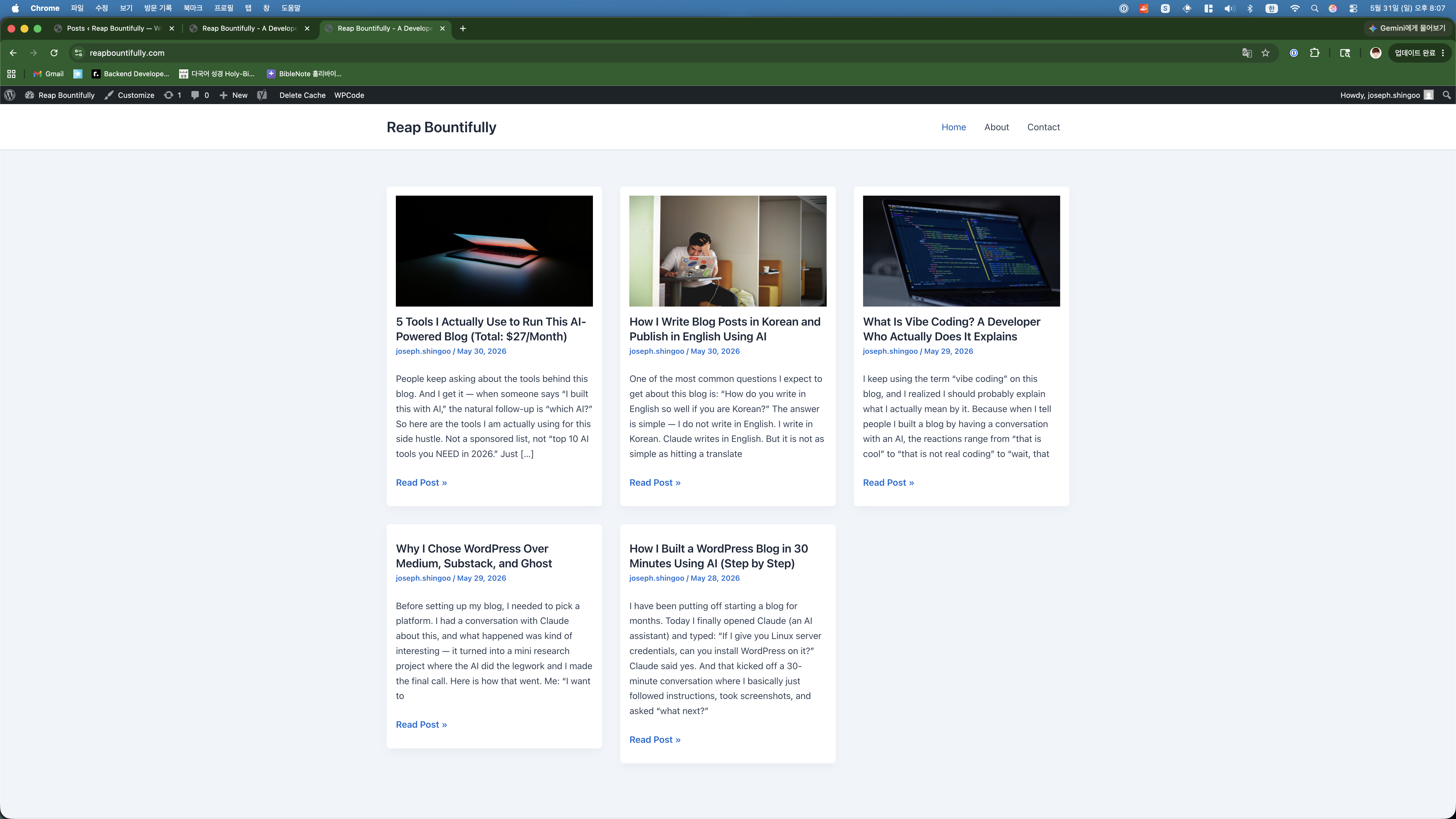
Same content, completely different presentation. The grid layout shows three posts per row with featured images, clear titles, author info, and a “Read Post” link. It looks like a real blog now, not a default WordPress installation.
What I Learned About WordPress Themes
- Default themes are fine for testing, not for production. They work, but they signal “I did not put effort into this site.”
- Free themes can look professional. Astra is free and the result looks clean and modern. No need to pay for a premium theme when starting out.
- Theme changes can break things. Switching themes is not just a visual change — it can affect layout, navigation, and post display. Be prepared to fix things.
- CSS is still king. Even with a good theme, you will probably need custom CSS tweaks. Having AI write the CSS saves a lot of trial-and-error.
How This Post Was Made
This one was fun. I told Claude I wanted to document the theme change process, and I asked it to temporarily switch back to the old theme so I could take “before” screenshots. It swapped themes with one command, I took the screenshots, and it swapped back. The whole thing took 30 seconds.
The before/after screenshots in this post are real — taken during the actual theme change process. Claude wrote the post around them, including the honest account of the title bug that took five attempts to fix. Transparency, as always.
This post was written with Claude AI. I provided the direction, topic, and screenshots in Korean — Claude turned it into the article you just read.